Porcupine
As some of you know, I'm currently working to analyze data I collected last summer, about recruitment in the Arctic deep sea. I worked with German collaborators to finish a long-term experiment, and we collected a set of brick and plastic panels that had been on the seafloor for 18 years. Since the cruise last August, I have counted, identified, and measured all the recruits that were on the panels and begun writing two papers about my findings.
I wanted to compare the recruitment patterns of my animals over time to environmental data, to see if there was any connection between what was going on in the environment and what animals settled on the panels in different years. My German collaborators have incredible long-term data sets from the Hausgarten observatory, where the recruitment experiment took place, so I'm able to mine the data and look for patterns. The most important environmental factor for my recruiting species is the current. All of the most common species on the panels eat particles or small animals in the water, so they rely on the bottom current to deliver their food. I wanted to see if there was any connection between current velocity and recruitment of these suspension feeders.
So I downloaded the German data. Friends, I'm not talking about a handful of numbers here. My German collaborators have measured the speed and direction of the bottom current at the central Hausgarten station every hour for the last 14 years.
That's 135,092 data points, in case you were wondering. No way I could do the analysis by hand.
Thankfully, there are some really great tools out there for working with gigantic datasets. I ended up using the code-based program Matlab for my analysis. Matlab is nice because it's so flexible - you can literally do anything with it - but the drawback is that you really have to know what you're doing. There are no buttons to push; you have to tell the program everything you want it to do in lines of code. More and more, I find myself doing code-based data analysis, and it's an incredibly important skill to have as a scientist.
 Matlab is also a good tool because there's a community of people who use the program and help one another out. I spent a few hours today searching through help forums online, trying to figure out how to do what I wanted to do. In the end, I figured it out - in fact, I was even able to piece together other people's scripts to accomplish what I needed to. I was able to plot my data.
Check out the figure at right here. Each stick shows the speed and direction of the bottom current at the central Hausgarten station on one day between 2003 and 2017. They're arranged chronologically left to right. Personally, I think the pile of sticks looks a bit like a blue porcupine, but it tells me some important things: (1) most of the time, the current is to the northwest, and (2) sometimes, the current is to the south or southeast. It's those anomalous days that I'm going to focus on, because they seem to be more common in certain years. I wonder if years with anomalous current have any differences in recruitment compared to other years.
It was a long day of coding, but my analysis is moving forward. I can't wait to see how my data match up!
I wanted to compare the recruitment patterns of my animals over time to environmental data, to see if there was any connection between what was going on in the environment and what animals settled on the panels in different years. My German collaborators have incredible long-term data sets from the Hausgarten observatory, where the recruitment experiment took place, so I'm able to mine the data and look for patterns. The most important environmental factor for my recruiting species is the current. All of the most common species on the panels eat particles or small animals in the water, so they rely on the bottom current to deliver their food. I wanted to see if there was any connection between current velocity and recruitment of these suspension feeders.
So I downloaded the German data. Friends, I'm not talking about a handful of numbers here. My German collaborators have measured the speed and direction of the bottom current at the central Hausgarten station every hour for the last 14 years.
That's 135,092 data points, in case you were wondering. No way I could do the analysis by hand.
Thankfully, there are some really great tools out there for working with gigantic datasets. I ended up using the code-based program Matlab for my analysis. Matlab is nice because it's so flexible - you can literally do anything with it - but the drawback is that you really have to know what you're doing. There are no buttons to push; you have to tell the program everything you want it to do in lines of code. More and more, I find myself doing code-based data analysis, and it's an incredibly important skill to have as a scientist.
 Matlab is also a good tool because there's a community of people who use the program and help one another out. I spent a few hours today searching through help forums online, trying to figure out how to do what I wanted to do. In the end, I figured it out - in fact, I was even able to piece together other people's scripts to accomplish what I needed to. I was able to plot my data.
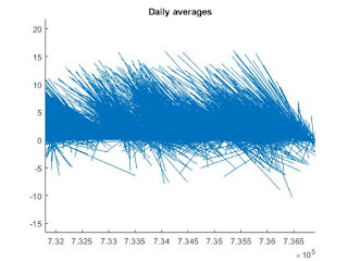
Check out the figure at right here. Each stick shows the speed and direction of the bottom current at the central Hausgarten station on one day between 2003 and 2017. They're arranged chronologically left to right. Personally, I think the pile of sticks looks a bit like a blue porcupine, but it tells me some important things: (1) most of the time, the current is to the northwest, and (2) sometimes, the current is to the south or southeast. It's those anomalous days that I'm going to focus on, because they seem to be more common in certain years. I wonder if years with anomalous current have any differences in recruitment compared to other years.
It was a long day of coding, but my analysis is moving forward. I can't wait to see how my data match up!
Comments
Post a Comment